
The Design Basics: What Not to Do During Your Next Renovation
Renovating your home is an exciting opportunity to reimagine how you live, move, and feel within your space. Yet, time and again across projects in Sussex, Surrey, London and Kent, we see the same well-intentioned, yet poor decisions quietly undermine an otherwise beautiful home.
Good design isn’t about following trends. Rather, it’s about avoiding the pitfalls that date a space, limit its functionality, or dilute its character. If you’re planning your next renovation, here are some of the most common missteps that we see across the industry, so you know what to steer clear of … and what to do instead.
Overused Spotlights
In recent years, there seems to be a temptation to blanket every ceiling with downlights, to the point where an open plan living and dining area can look like the next runway at Gatwick airport. On paper, it feels clean and modern, but in reality it results in flat, unflattering light, that drains the room of any warmth or atmosphere. Lighting should be layered, not uniform, so relying solely on spotlights can create harsh shadows and a clinical feel – more operating theatre than inviting home.
Instead, consider a combination of ambient, task and accent lights, incorporating wall lights, ceiling lights and table lamps. For example, a beautiful pendant or two provide your overheard ambient lights (often referred to as ‘the big light’!), with a single downlight to over a desk area (for example) as your task lighting, and picture lights or floor lamps as the accent, rounding off the layered approach to your lighting plan.
Lighting should guide the eye and create micro-zones, not just illuminate everything equally.
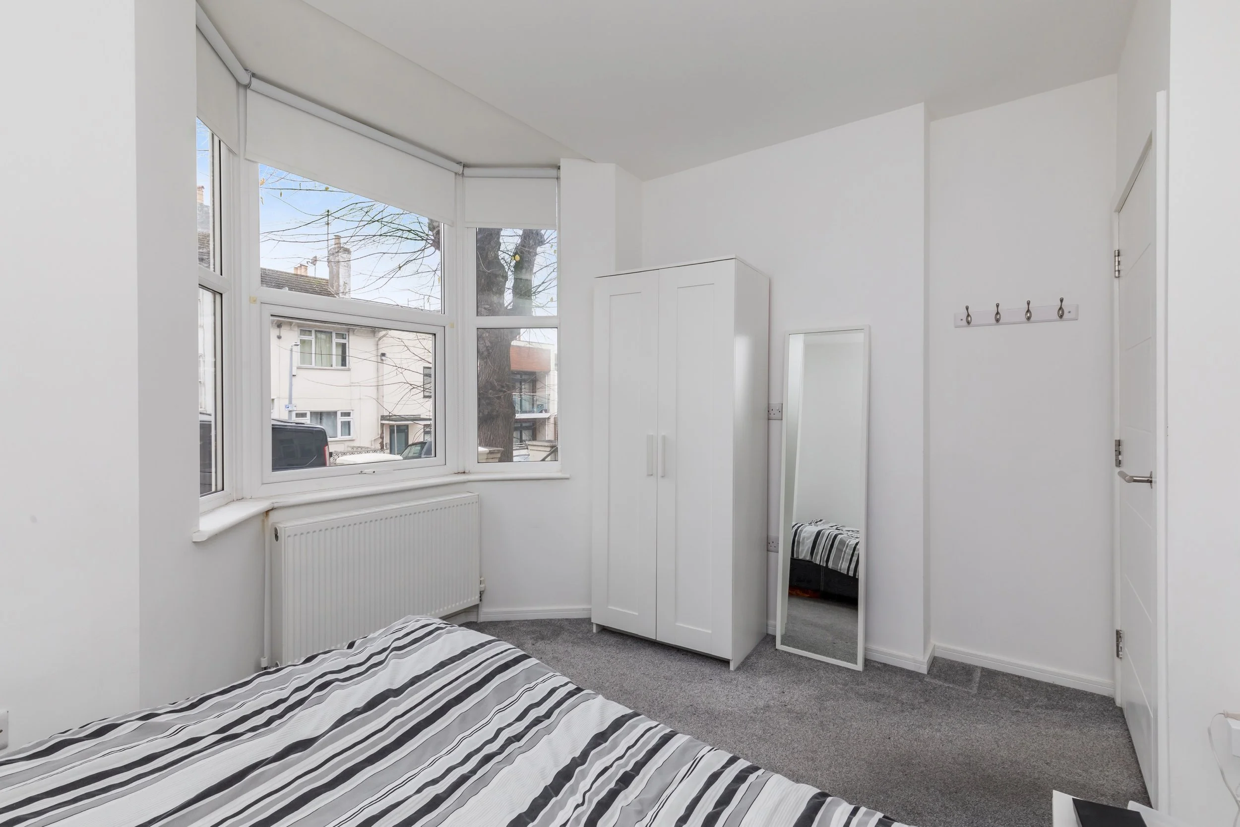
Sofas Against Walls
This is one of the most instinctive layout choices, and yet one of the least effective. Pushing all furniture to the perimeter can leave a room feeling disconnected and oddly sparse in the centre, and also make the room feel smaller (and dare we say cheap!)
Consider ‘floating’ your furniture instead. Even in smaller rooms, pulling a sofa slightly away from the wall and anchoring it with a rug can create a far more intimate and considered layout. Alternatively, if you are limited on space, bring a sofa forward just slightly with a slimline console table between the sofa and the wall, or recess some book shelving into the wall above.
Think in terms of zones rather than edges.
Bedroom Sets
Matching bedroom furniture sets - often a bed, bedside tables, chest of drawers and wardrobe - can feel like an easy solution, but they often result in a space that lacks personality and feels overly uniform, like a cheap and outdated showroom.
It’s important to remember to curate rather than coordinate, mixing materials, finishes, and styles to create depth. A vintage bedside table paired with a contemporary bed can bring far more interest than a perfectly matched set ever could.
Defaulting to Grey Carpets
Unfortunately (in our opinion), grey has dominated interiors for the better part of a decade, and while it can work beautifully in the right context, overuse has left many homes feeling cold and indistinct – not to mention the connotations it holds with glitter wallpaper, mirrored furniture sets and metallics!
Grey carpets in particular, can flatten a room and limit your palette moving forward. Instead, if you’re wanting to go neutral, look at warmer tones such as soft taupes, natural wool tones, or even subtle patterns. Flooring should ground a space and add texture, not wash it out.
The standard grey pile carpet on full display at our ‘Small but Mighty’ Brighton Apartment project, before we replaced it with a beautifully warm walnut floor.
Ignoring Context and Architectural Detail
In the pursuit of “modernising” a home, original features are often stripped away—cornicing removed, fireplaces boarded up, and joinery simplified. Once gone, these details are rarely reinstated with the same authenticity.
Instead, embrace your home for what it is, and work with it’s very bones, not against. Whether it’s a Victorian terrace or a countryside cottage, lean into its architectural language. Contemporary design can sit beautifully alongside period features when handled with care.
Similarly, it’s important to remember the surroundings of a home – trying to dress a countryside cottage as a coastal retreat in the Caribbean can leave a space feeling totally nonsensical and mismatched.
Forgetting the Ceiling
Though painting or papering a ceiling can often feel daunting, it truly is the fifth wall and should not be treated as an afterthought. They make up a significant visual plane in any room and have enormous potential to elevate a scheme when treated with consideration.
This doesn’t mean it needs to be bold for the sake of it – even a soft tonal paint, subtle texture or timber detailing can draw the eye upward and add depth.
A neglected ceiling can leave even the most carefully designed space feeling incomplete.
Final Thoughts
A successful renovation isn’t about doing more, but about doing the right things, thoughtfully. By avoiding these common missteps, you’re more likely to produce a home that feels considered, cohesive, and quietly confident.
Design, at its best, should feel effortless. And that effortlessness is almost always the result of knowing exactly what not to do …
Speaking of, do contact us today if you’d like a home driven by expert guidance.