
What’s Hot and What’s Not: Our Round Up of 2026 Interior Design Trends
Every January, as our clients return from their holidays with an appetite for ‘fresh starts’ and a renewed interest in beautiful and soulful surroundings, I find myself asking “What’s next?”. This goes for both my business, but also my own tastes, and the design industry as a whole.
For Piers Thurston Home, 2026 promises to be a year of interiors that feel deeply human – characterful, warm, full of the personality of our clients, and a little less intent on perfection. Think layered spaces that tell stories, individual heirloom pieces that stand out but in the best way, and a collective shift away from trend-led sameness. For homeowners in the South East considering a luxury renovation or full-home redesign, this year is all about moving beyond trends and towards spaces with emotional longevity.
This isn’t so much a review of the plethora of trend forecasting that saturates Instagram this time of year, nor is it a narration on those we predict will come to fruition. Rather, it is a summary of where we’re heading in 2026 – and what we’re gently leaving behind.
What’s Hot?
Lived-In Interiors
Really, this goes without saying, and is something we stand by year in, year out. Perfection is dull, but patina is poetry, so we continue to push for interiors that feel inhabited – rows of well-thumbed books to a bookshelf, a rumpled linen sofa … the gentle mess of a life well-lived.
Whether you’re planning a luxury renovation in Brighton, or a heritage restoration in Kent, lived-in elegance should define the brief.
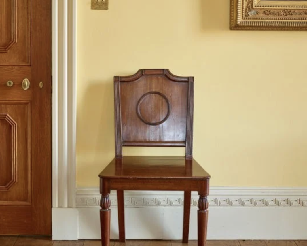
Butter Yellow
Not pastel. Not neon. Butter.
Becoming increasingly popular across Instagram and Pinterest, this soft, cultured yellow can warm cabinetry, uplift upholstery and flatter every corner it touches. Think Ochre by Edward Bulmer – sophisticated, gentle, friendly, and surprisingly versatile with tobacco browns, smoky blues, and olive greens. What’s more, it’s stunning in the period homes that Sussex and Kent have to offer, where natural light plays a starring role.
Pair it with walnut or unlacquered brass for a quietly confident palette.
Ochre, by Edward Bulmer. Image courtesy of Edward Bulmer.
Independent Print & Fabric Suppliers
Do it. Dare to look beyond the Sanderson Design Group.
Of course, there are many gorgeous designs available under this umbrella, many of which we have used ourselves. But with a little more research there is a catalogue of independent, family-operated fabric and print houses who create truly beautiful pieces and would love your support. I’m thinking Tori Murphy for a stand-out door curtain with flop-over heading, Sophia Frances for their printed upholstery fabrics, Annika Reed for the perfect nursery print, or Melin Tregwynt if you’re looking for a delightfully colourful Welsh blanket.
The same goes for wallpaper too – the point is, shop independent!
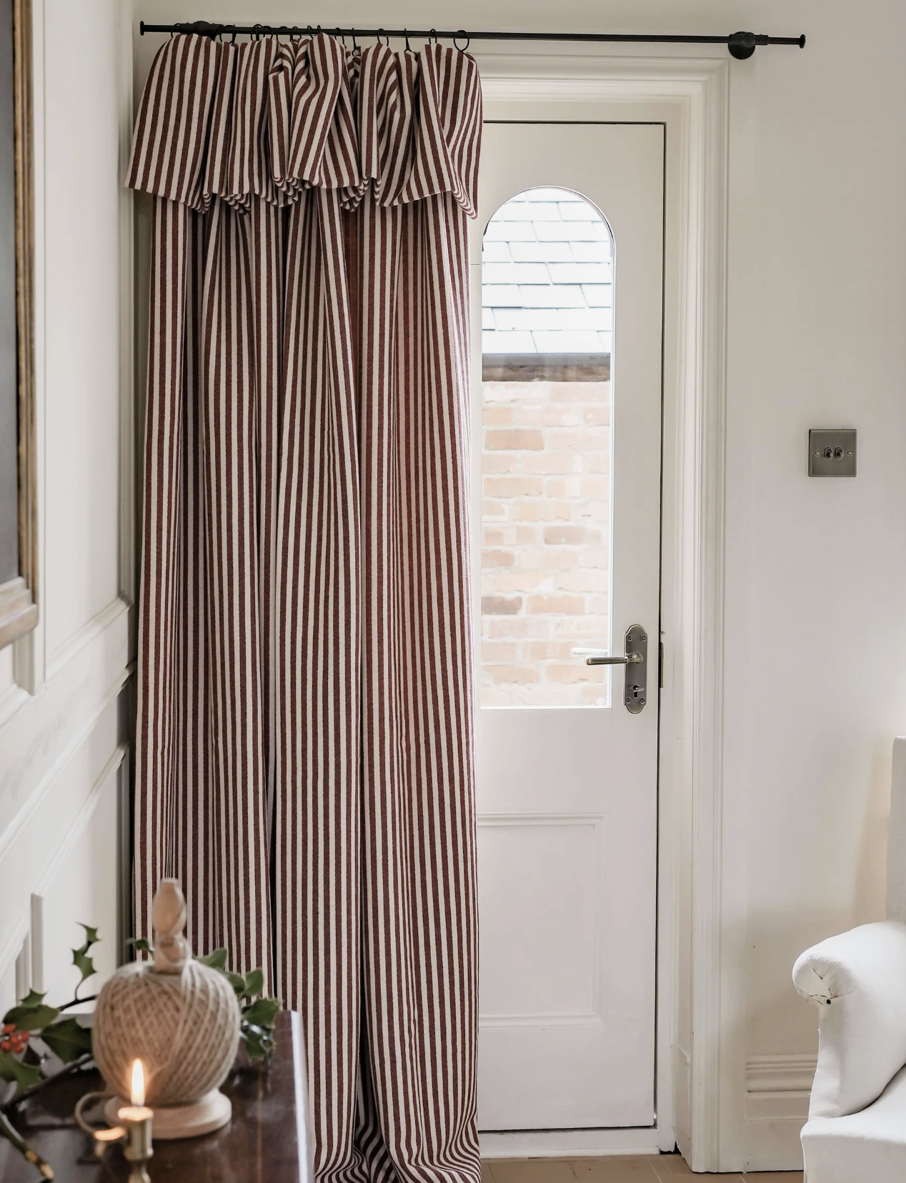
Ready-made door curtain by Tori Muprhy. Image courtesy of Tori Murphy
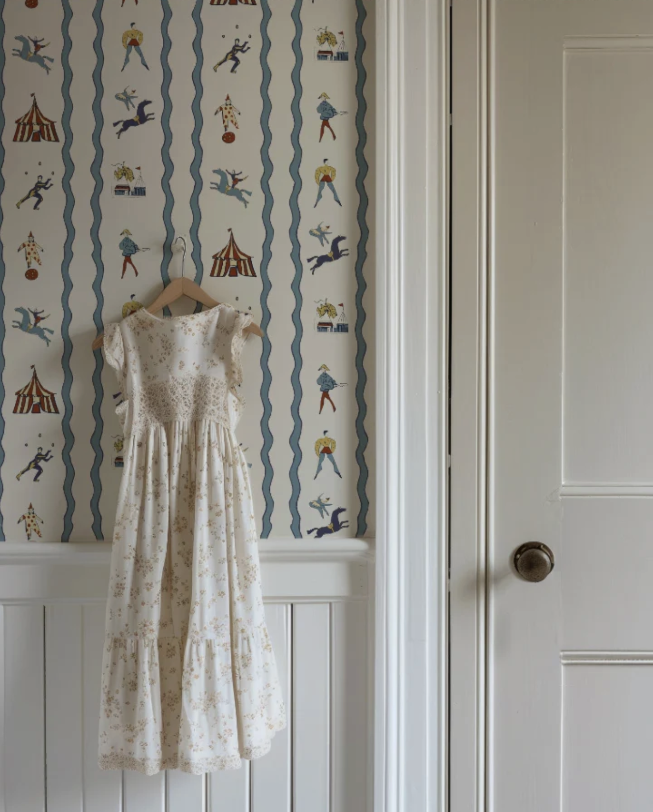
‘Runaway to the Circus’ wallpaper. Image courtesy of Annika Reed
Illustration & Art
Your home deserves better than mass-market prints. Clients are collecting – not decorating – and original illustration is becoming the understated signifier of taste. Think coastal linework, architectural sketches or prints of a hand-painted quality. Imperfect, emotional and magnetic.
A new, (but rapidly expanding) entrant to the field, Tilly Lock, is proof that such tastes are growing in popularity.
Decorative Detailing
Minimalism has been and gone; decoration makes a triumphant return.
Cornices, borders, frilled lampshades, decorative mouldings, hand-painted illustrations to walls, a whisper of trim to a skirted console – not maximalist but considered. It’s the art of knowing where a detail sings and where it distracts.
What’s Not [Hot]
Boucle
We loved it. We lived it. We sat on it.
And now it’s time to let it rest. The texture movement continues, but we’d rather look to velvets, heavy linens or textured wools to step in where boucle once reigned supreme.
Cloud Dancer (Pantone Colour of the Year)
Apologies extended to Pantone, but in our opinion, they’ve missed the mark for two years running. Yes, this gentle white hue photographs beautifully, but it rarely flatters in real life, and certainly does not hold the power to evoke an emotional response … outside of boredom, that is.
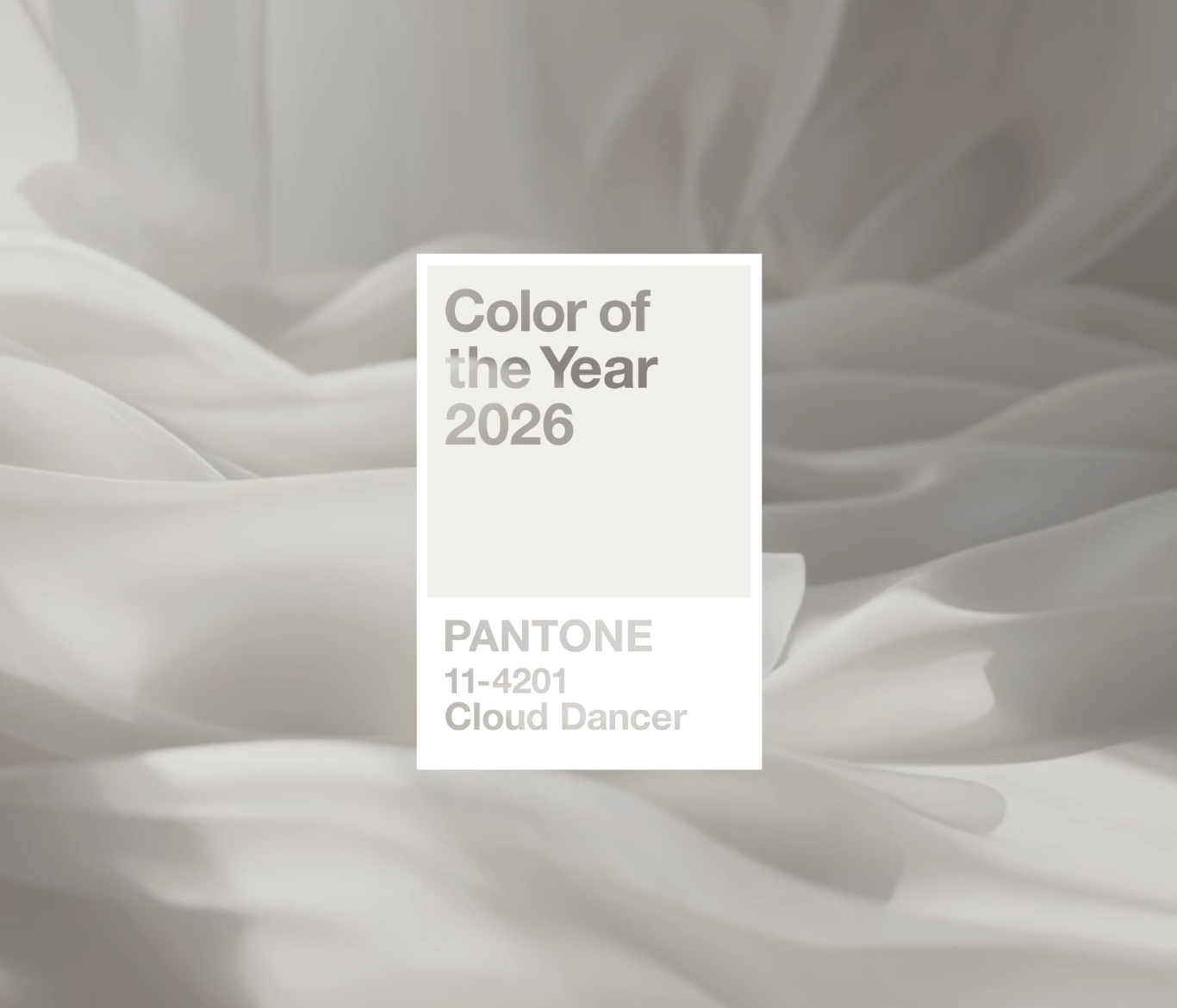
Cloud Dancer, Pantone’s Colour of the Year 2026. Image courtesy of Pantone.
Feature Walls
Feature walls had a good run, but their charm feels a little lacklustre now – like a rushed design solution from a television makeover show. Instead, embrace immersive colour, enveloping rooms in tone-on-tone hues that feel richer and more intentional, or wrap a room in the same wallpaper.
Bobbins & Scallops
I said this last year, and I’ll say it again - charming, yes. Timeless and enduring, no.
Scallops and bobbins aren’t ‘wrong’, they’re just loud now, particularly in a landscape that is moving toward quiet decoration and subtler detailing that tend to give a more high-end finish – think fluting, ribbing and micro-beading.
It’s sweet, but in the wrong environment it can feel like cottagecore cosplay.
Marble Everything
Listen, we all know marble can be beautiful when used correctly. But for 2026, I want to see the “marble waterfall & marble backsplash & marble island & marble coffee table” formula left behind. And don’t get us started on misaligned veining! Instead, we’ll be looking to layer contrasting materials that are more visually interesting and invite touch – timber and limestone, for example.
As we move into the new year, design with your heart and habits in mind. A home is not a backdrop to life – it is the sanctuary in which we inhabit, and one which should reflect your memories, not the latest market trends.
Trends are simply suggestions. Taste is what you build with time.